.svg)
SIGN UP FOR JUICEBOX (IT’S FREE!)

Who are you looking for?
Thank you! Your submission has been received!
Oops! Something went wrong while submitting the form.

We just shipped the largest update yet to our company data and talent insights.
If you've ever wanted to know more about a company before sourcing, where their talent comes from, how fast they've grown, and what kind of talent profiles they hire.
Here’s what’s new:
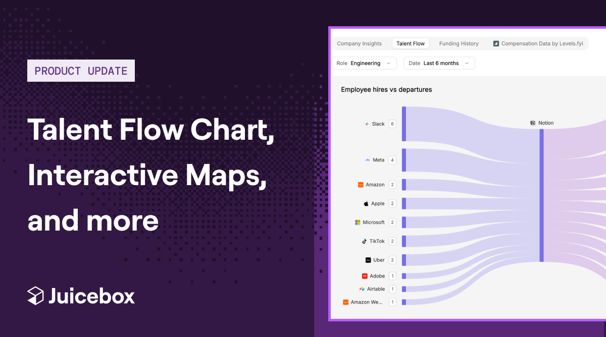
See where a company's talent comes from and where it goes.
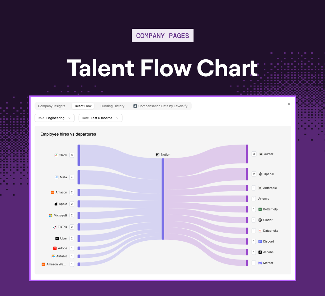
Every company has a talent story.
Starting today, company pages include a flow chart showing hiring vs. departures over time.
You can now:
Source from the companies already feeding talent your way or find out where the competition is losing theirs.
Understand the landscape of your talent pool before you start outreach
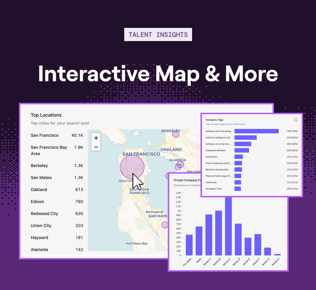
The best sourcers don't just find talent, they understand the market they're sourcing from.
Talent insights change how you prioritize, how you pitch, and which candidates you reach out to first.
Starting this week, here's three new views:
Go into every search equipped with even more data to back every strategic decision you make.
Additional company composition data, now built into every company page
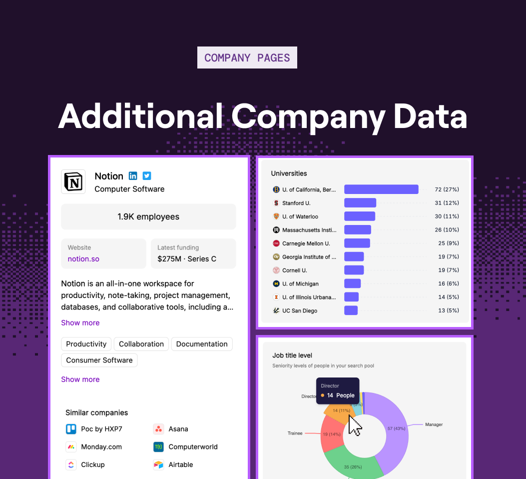
Is this company more senior-heavy or junior-first?
Now, you can tell before you begin sourcing from any target company.
There's a few new data views built into every company page:
You'll now see whether a company matches your hiring bar before you build a single search around it.
Understand the story behind when someone joined and left a company
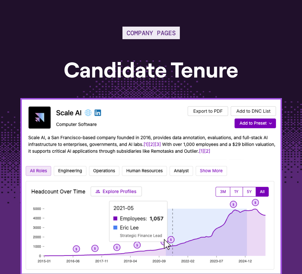
In case you missed the last update, when you open a candidate's company page from their profile, their tenure is highlighted directly on the headcount graph.
Someone who joined during a high-growth run and stayed may tell a very different story than another candidate who joined a few months before a layoff.
Every user can now see:
You can visually tell who scaled with a company, who weathered downturns, and who came in during rebuild phases.
Try all these new features on Juicebox – live now.
We'd also be glad to discuss further on a call. Please feel free to reach out to sales@juicebox.work or book a demo here: https://juicebox.ai/demo
{{large_cta}}
Run your first search for free. Find and engage top talent across 800M+ profiles. Trusted by 4,000+ customers.